Calibration Plot
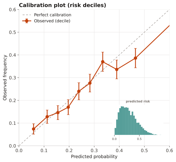
Validation diagnostic for a risk model: observed event frequency versus predicted probability across risk strata, against the 45° line of perfect calibration.
When validating a probabilistic prediction model — calibration (are predicted risks correct in magnitude?) is distinct from discrimination (ROC/AUC). A model can discriminate well yet be poorly calibrated and unsafe for decision thresholds.
Points on the 45° line are well-calibrated; above the line means under-prediction, below means over-prediction. A consistent slope departure signals a need for recalibration (intercept/slope) before deployment.
A risk model's predictions for 5,000 patients are grouped into deciles of predicted probability; within each decile the mean predicted risk (x) is plotted against the observed event frequency (y), with 95% binomial error bars.
Result: The decile points track just below the 45° line, indicating slight over-prediction (observed ≈ 0.92 × predicted); discrimination is unaffected, but a recalibration slope of ~0.92 would bring predictions onto the diagonal.
Reference: Gatto NM, Wang SV, Murk W, et al. Visualizations throughout pharmacoepidemiology study planning, implementation, and reporting. Pharmacoepidemiol Drug Saf. 2022;31(11):1140-1152.