Data-Source Feasibility Heatmap
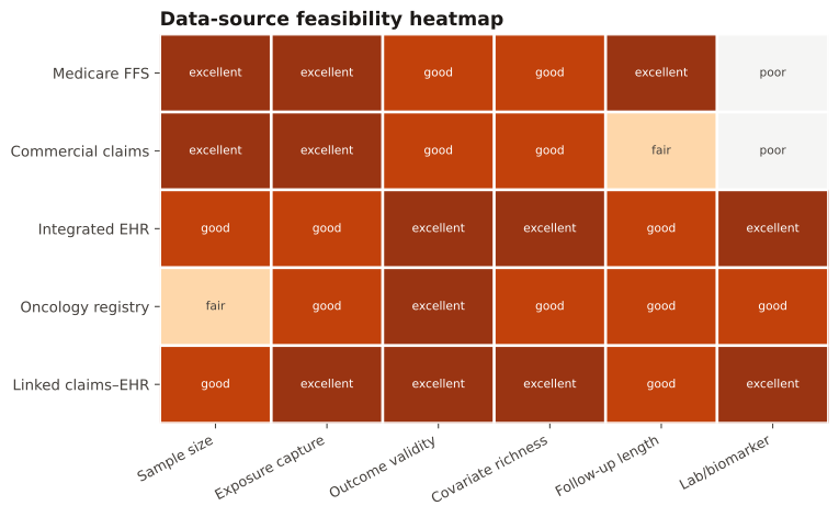
Ranks candidate data sources against the study's key requirements in a color-graded matrix, making the fit-for-purpose decision explicit and auditable.
During data-source selection (the SPIFD / fit-for-purpose step), to compare datasets against requirements like sample size, exposure capture, outcome validity, covariate richness, follow-up length, and lab availability — before committing to a source.
Rows are datasets, columns are study requirements, color encodes suitability (poor→excellent). Scan for a row that is strong across the requirements that matter most for your question; a single 'poor' cell on a critical requirement can rule a source out regardless of its other strengths.
Five data sources are scored 0–3 (poor→excellent) against six study requirements; the matrix is shaded so the most fit-for-purpose source stands out.
Result: Linked claims–EHR scores highest overall (sum 16/18) — strong on outcome validity, covariates, and labs where pure claims score 'poor' (0) on biomarkers — making it the fit-for-purpose source if linkage selection is acceptable.
Reference: Gatto NM, Wang SV, Murk W, et al. Visualizations throughout pharmacoepidemiology study planning, implementation, and reporting. Pharmacoepidemiol Drug Saf. 2022;31(11):1140-1152.