State-Transition (Markov) Diagram & Cohort Trace
The structure of a Markov cost-effectiveness model (states and transition probabilities) alongside its cohort trace — the share of the cohort in each state over model cycles.
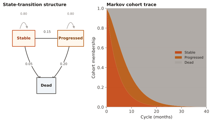
To document and sanity-check a state-transition economic model. The diagram communicates structure; the trace verifies the model behaves sensibly (membership sums to 1 each cycle, the absorbing state fills monotonically) before costs/QALYs are attached.
Diagram arrows are per-cycle transition probabilities (rows of the transition matrix sum to 1). In the trace, each band is a state's share over time; a well-formed model drains transient states into the absorbing (Dead) state.
A 3-state model (Stable → Progressed → Dead) with a transition matrix is run for 40 monthly cycles starting from everyone Stable. Each cycle the state vector is multiplied by the transition matrix to produce the next cycle's membership.
Result: After one cycle the cohort is [0.80, 0.15, 0.05] (1×0.80, 1×0.15, 1×0.05); after two cycles Stable = 0.80×0.80 = 0.64. Over 40 cycles the trace drains into Dead, with Progressed peaking mid-horizon — the expected, well-behaved shape.
Reference: Gatto NM, Wang SV, Murk W, et al. Visualizations throughout pharmacoepidemiology study planning, implementation, and reporting. Pharmacoepidemiol Drug Saf. 2022;31(11):1140-1152.