Precision–Recall Curve
Plots precision (PPV) against recall (sensitivity) across thresholds — the discrimination figure to use when the outcome is rare and ROC/AUC would look deceptively strong.
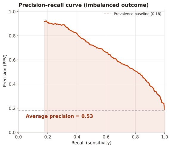
For imbalanced outcomes (rare events), where a high AUC can coexist with poor positive predictive value. The PR curve and average precision focus on performance among predicted positives, which is what matters when prevalence is low.
The curve trades precision for recall as the threshold drops; the flat line is the prevalence (a no-skill classifier). Area under the curve (average precision) above the prevalence baseline indicates useful ranking among the positive class.
A model score for 4,000 patients with an 18% event rate is thresholded across its range; precision and recall are computed at each threshold and plotted, against the 0.18 prevalence baseline.
Result: The PR curve sits well above the 0.18 baseline with average precision ≈ 0.55 — so the model ranks true positives far better than chance even though the outcome is rare, a conclusion the ROC curve (AUC) would express less honestly at this prevalence.
Reference: Gatto NM, Wang SV, Murk W, et al. Visualizations throughout pharmacoepidemiology study planning, implementation, and reporting. Pharmacoepidemiol Drug Saf. 2022;31(11):1140-1152.