Propensity Score Overlap (Mirrored Histogram)
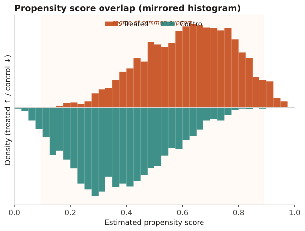
Positivity diagnostic: the distribution of the estimated propensity score in treated vs control, shown back-to-back to reveal the region of common support.
Before estimating a treatment effect, to check the positivity assumption. Poor overlap (scores near 0 only in controls, near 1 only in treated) means some patients have no comparable counterpart and the effect is not identifiable without trimming.
The shaded common-support band is where both groups have mass. Spikes at 0 or 1, or a long tail present in only one arm, signal positivity violations; trimming or redefining the target population may be required.
A logistic propensity model is fit and the predicted score is histogrammed for ~4000 treated (plotted upward) and ~4000 control (plotted downward). The overlap region is the score range present in both arms.
Result: Both arms have density across roughly 0.15–0.95, so common support is wide and positivity holds over that band; only the extreme tails (<0.1 control-only, >0.95 treated-only) would be candidates for trimming.
Reference: Gatto NM, Wang SV, Murk W, et al. Visualizations throughout pharmacoepidemiology study planning, implementation, and reporting. Pharmacoepidemiol Drug Saf. 2022;31(11):1140-1152.