Sankey / Alluvial Diagram (Treatment Patterns)
Visualizes how patients flow between therapies across lines of treatment, sizing each ribbon by the number of patients making that transition.
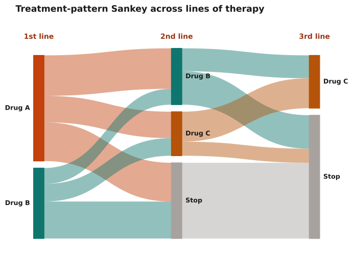
To summarize sequential treatment decisions (1L→2L→3L), switching, and discontinuation in a single figure. Best for 2–4 stages and a small set of drug classes; beyond that, ribbons overlap and a transition matrix/table is clearer.
Node height = patients on that therapy at that line; ribbon width = patients moving between two therapies. Conservation holds — flows into a node equal flows out (plus discontinuation). Color ribbons by source to trace cohorts.
1000 patients start first-line therapy (600 Drug A, 400 Drug B) and are followed across second and third lines. Transition counts between each pair of therapies (and to discontinuation, 'Stop') size the ribbons.
Result: Of 600 Drug A initiators, 220 (37%) discontinue by second line and 380 switch; the largest single flow is the 430 patients who reach 'Stop' by second line, and conservation checks (A→B 230 + B→B 90 = 320 into the 2L Drug B node).
Reference: Gatto NM, Wang SV, Murk W, et al. Visualizations throughout pharmacoepidemiology study planning, implementation, and reporting. Pharmacoepidemiol Drug Saf. 2022;31(11):1140-1152.