Tornado Diagram
One-way deterministic sensitivity analysis: each parameter's plausible range is swept and the resulting swing in the model output is shown as a bar, ranked widest-on-top.
To rank which model inputs most influence a cost-effectiveness result. It captures parameter influence one-at-a-time; for joint/decision uncertainty pair it with a probabilistic sensitivity analysis (CE plane / CEAC).
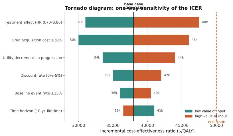
The vertical line is the base-case output (e.g., ICER); each bar spans the output at the input's low and high value. Longer bars = more influential inputs. A bar crossing the willingness-to-pay threshold flags a decision-relevant parameter.
A cost-utility model has base-case ICER $38,000/QALY. Six inputs are each varied to their low and high plausible values and the model re-run; bars are sorted by the absolute swing in the ICER, against a $50,000 WTP line.
Result: Treatment effect is the dominant driver (swing $16,500, 31k–47.5k) and its high end crosses the $50k threshold; discount rate and baseline event rate barely move the ICER, so value-of-information effort should target the effect estimate.
Reference: Gatto NM, Wang SV, Murk W, et al. Visualizations throughout pharmacoepidemiology study planning, implementation, and reporting. Pharmacoepidemiol Drug Saf. 2022;31(11):1140-1152.