Violin-Raincloud Plot (Cost Distributions)
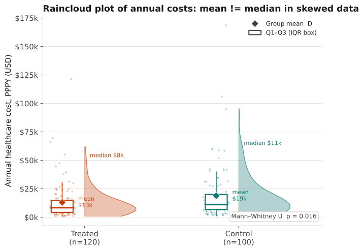
Combines a half-violin (kernel density), jittered individual-patient cost dots, and a compact box-whisker to display the full distribution of skewed annual healthcare costs for two groups side by side.
Any analysis with heavily right-skewed continuous outcomes — most healthcare cost and utilization endpoints. A simple bar chart of mean costs hides the skewness and is easily distorted by a few extreme outliers. Use the raincloud plot when you need to communicate the full distribution to a clinical or regulatory audience, or when reporting requires medians alongside means (e.g., HEOR budget-impact dossiers). Pair with a Mann–Whitney U test or quantile regression for inferential comparisons.
The violin half (right side of each group axis): kernel density estimate — wider sections indicate more patients at that cost level. Jittered dots (strip chart): one dot per patient — reveals the actual data density, sample size, and outlier structure. Box: thick line = median; box edges = Q1 / Q3; whiskers = 1.5 × IQR. Diamond (annotated): group mean — when the diamond sits notably above the median line, the distribution is right-skewed and the mean overstates the typical patient cost. Compare the two diamond heights for mean-difference inference; compare the two median lines for median-difference inference (Mann–Whitney / quantile regression).
220 patients (120 treated, 100 control) with annual healthcare costs drawn from log-normal distributions (seed 17). Log-scale parameters: Treated ~ N(−0.3, 0.9), Control ~ N(0.0, 1.0), each scaled by $12,000 to bring medians into a realistic HEOR cost range. Both distributions are heavily right-skewed.
Result: In both groups the mean (diamond) lies substantially above the median (box line), illustrating right skew. The control group has both higher median and higher mean costs. Mann–Whitney U test: p = 0.016 — distributions differ significantly at alpha = 0.05. Quantile regression at the 50th percentile would estimate the median cost difference as ≈ $2,700 PPPY (control higher), whereas a comparison of means would suggest ≈ $5,800 — highlighting why choice of central-tendency measure matters in cost analyses.
Reference: Gatto NM, Wang SV, Murk W, et al. Visualizations throughout pharmacoepidemiology study planning, implementation, and reporting. Pharmacoepidemiol Drug Saf. 2022;31(11):1140-1152.