Calendar-Time Accrual Plot
Shows how the cohort accrues over calendar time — monthly new initiators and the cumulative N — surfacing enrollment ramps, secular trends, and the data-cut boundary.
During implementation, to document accrual and spot calendar-time issues: an enrollment ramp after a guideline change, a policy shock, seasonal patterns, or sparse person-time near the data cut that will thin late follow-up. Complements the event-time design diagram.
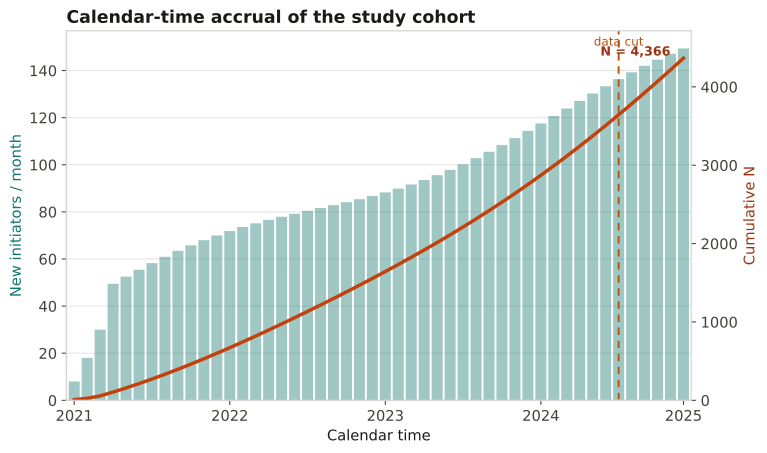
Bars are new initiators per calendar month (incidence over time); the line is the cumulative cohort. A steep change in the bars flags a secular trend or formulary event to adjust for; thin accrual just before the data cut warns that late-index patients have little follow-up.
New initiators are counted per calendar month over 4 years (2021–2025); a bar shows the monthly count and a line shows the running cumulative cohort, with the data-cut month marked.
Result: Monthly accrual climbs from ~8 to ~140 as uptake grows, and the cumulative cohort reaches ≈2,300 by the data cut. The visible post-2022 ramp is a secular trend worth adjusting for, and the thin final months mean late initiators contribute little follow-up time.
Reference: Gatto NM, Wang SV, Murk W, et al. Visualizations throughout pharmacoepidemiology study planning, implementation, and reporting. Pharmacoepidemiol Drug Saf. 2022;31(11):1140-1152.