Cohort Attrition Funnel
Step-by-step record of how the source population is filtered to the final analytic cohort, with the count remaining and the reason removed at each step.
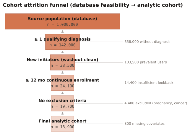
In every database study, as the transparency backbone of cohort definition. It is the RWE analogue of a CONSORT flow diagram and is expected by STaRT-RWE and most journals and HTA reviewers.
Each tier shows N remaining; the side annotation shows N removed and why. Large, unexplained drops or a tiny final cohort relative to the source flag selection that may threaten generalizability.
A claims study filters a 1,000,000-member source population down to the analytic cohort through five successive criteria, recording the count retained and the count excluded (with reason) at each step.
Result: The analytic cohort is 18,900 (1.9% of source). The largest drop is the diagnosis requirement (858,000 removed); the new-user washout removes a further 103,500 prevalent users — the step most relevant to avoiding prevalent-user bias.
Reference: Schneeweiss S, Rassen JA, Brown JS, et al. Graphical Depiction of Longitudinal Study Designs in Health Care Databases. Ann Intern Med. 2019;170(6):398-406.