Lasagna Plot (Longitudinal Status)
A horizontally-layered heatmap with one row per patient and one column per time unit, color-coding treatment status over follow-up — a dense companion to the swimmer and Sankey plots.
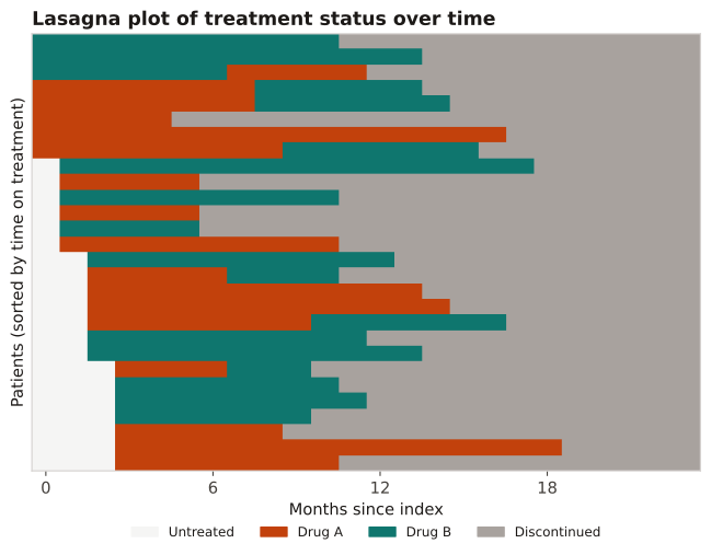
For moderate-to-large cohorts where you want to see treatment status (on drug A, on drug B, untreated, discontinued) across the whole cohort at once. Sorting rows reveals adherence, switching, and discontinuation patterns a swimmer plot can't show at scale.
Each row is a patient, each column a month; color is the treatment state. Reading down a column shows the cohort's status at that time; reading across a row shows one patient's trajectory. Sort rows (e.g., by time on treatment) to surface structure.
28 patients are followed for 24 months; each patient-month is classified as untreated, on Drug A, on Drug B, or discontinued, and rows are sorted by total time on treatment.
Result: The sorted heatmap separates persistent users (long colored bands at the top) from early discontinuers (gray-dominated rows at the bottom), and the scattered A↔B color changes mid-row make switching visible across the whole cohort in one figure.
Reference: Gatto NM, Wang SV, Murk W, et al. Visualizations throughout pharmacoepidemiology study planning, implementation, and reporting. Pharmacoepidemiol Drug Saf. 2022;31(11):1140-1152.