Spaghetti / Trajectory Plot
Shows each patient's repeated-measure trajectory over time as a faint line, with bold group means — the standard figure for longitudinal biomarkers feeding mixed or GEE models.
When the outcome is a repeated continuous measure (HbA1c, eGFR, blood pressure) and you want to show both within-patient change and between-group differences before/after a mixed-effects or GEE analysis. Reveals heterogeneity a mean trajectory alone hides.
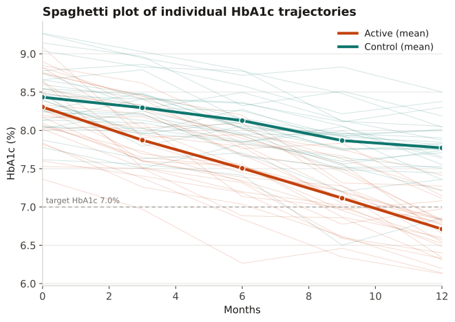
Faint lines are individual patients; bold lines are group means. Spread around the mean shows between-patient variability; crossing or fanning lines hint at heterogeneity of response that a random-slope model would capture.
HbA1c is measured at 0, 3, 6, 9, 12 months for two arms; each patient is a faint line and the bold lines are the per-arm means, against a 7.0% treatment target.
Result: Individual trajectories vary widely, but the active-arm mean falls from 8.4% to ~6.8% (below target) while control reaches ~7.7%; the visible fanning of individual lines signals heterogeneous response, motivating a random-slope mixed model.
Reference: Gatto NM, Wang SV, Murk W, et al. Visualizations throughout pharmacoepidemiology study planning, implementation, and reporting. Pharmacoepidemiol Drug Saf. 2022;31(11):1140-1152.