Swimmer Plot
One horizontal bar per patient showing time on treatment, response milestones, and events — the standard individual-level exposure/response figure in oncology RWE.
For small-to-moderate cohorts where individual trajectories matter — duration of response, timing of progression vs death, ongoing responders. Not for large cohorts (use KM/CIF), where one-row-per-patient becomes unreadable.
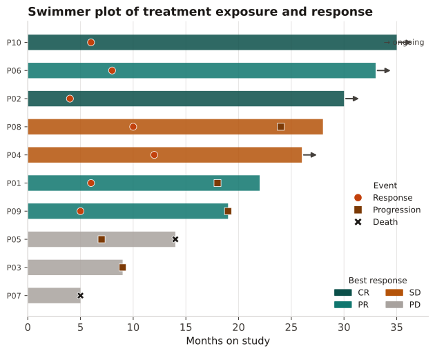
Bar length = time on study; color = best response; markers = response/progression/death timing; an arrow = still on treatment at data cut. Sort by duration to reveal the responder/non-responder gradient.
Ten patients with start/stop months, best overall response (CR/PR/SD/PD), and the timing of response, progression, and death events; rows sorted by time on study, with an arrow for patients still on treatment at the data cut.
Result: Responders (CR/PR) cluster among the longest bars; three patients remain on treatment at the cut (arrows), and the two shortest bars end in death markers at 5 mo, visually separating durable benefit from early failure.
Reference: Gatto NM, Wang SV, Murk W, et al. Visualizations throughout pharmacoepidemiology study planning, implementation, and reporting. Pharmacoepidemiol Drug Saf. 2022;31(11):1140-1152.